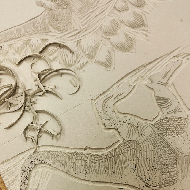
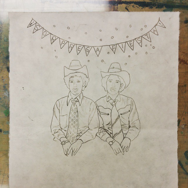
Here’s a little peek at an heraldic portrait woodcut I’m working on as a gift for some dear friends who are getting married. It’s a 5.5 by 8 inch block of cherry wood, a little harder than what I’m used to carving but it holds fine detail beautifully.
While on vacation we took a class in how to tie some simple knots for use around the campsite. Now I can’t stop thinking about knots! This is the Carrick Bend, a useful join for two lines of equal weight, and also a typical knot used in heraldry due to its beautiful shape. Here it’s being used to tie together two banners.

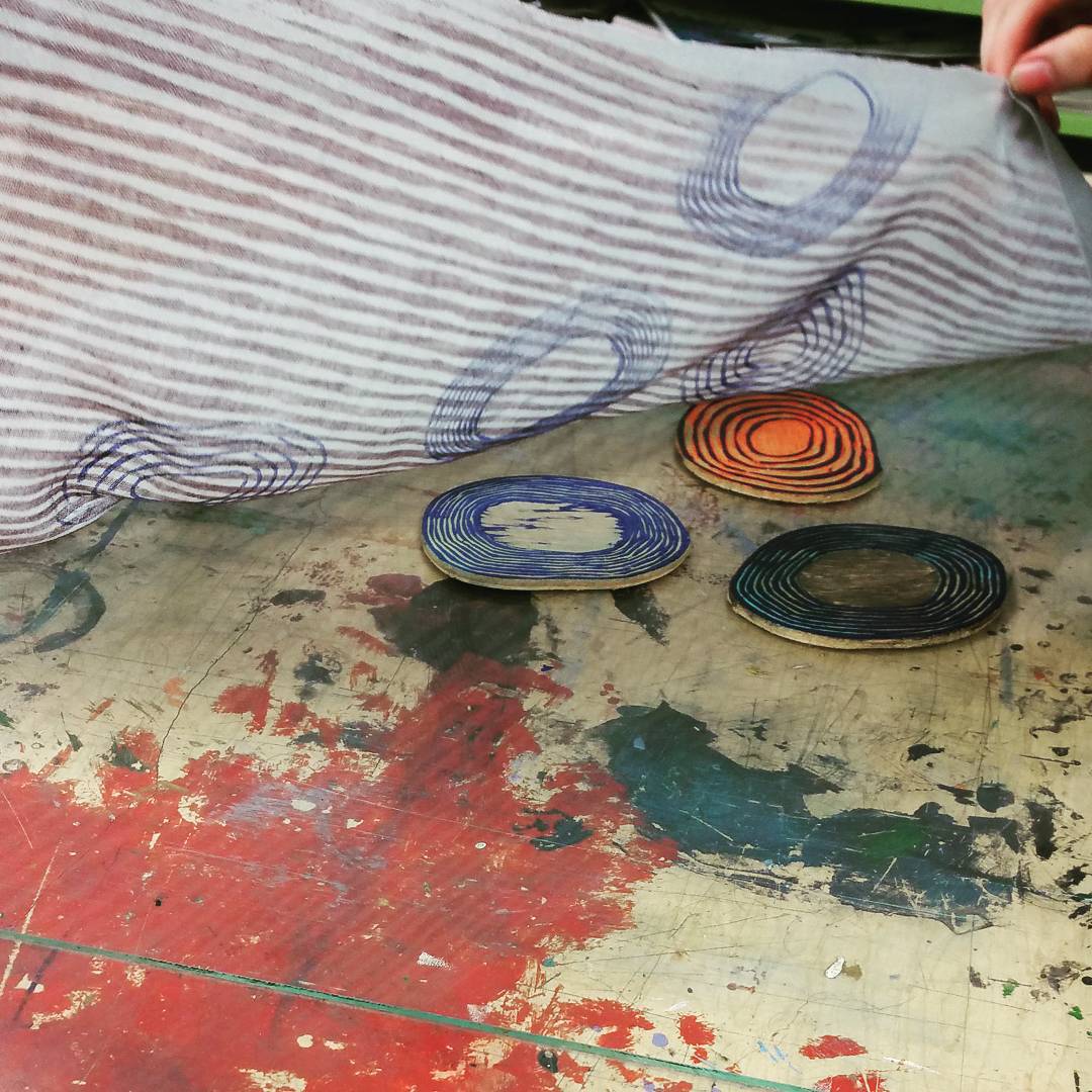
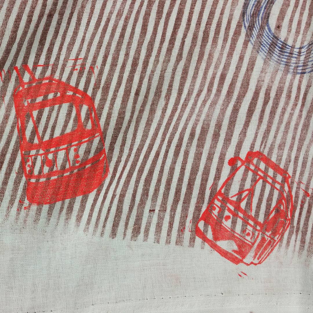
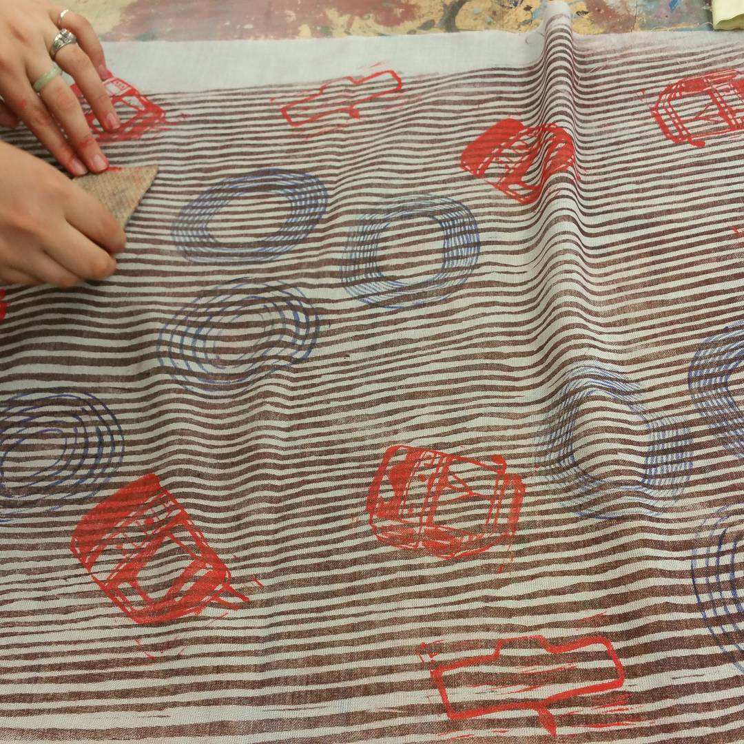
Alyssa was here in the studio today doing some block printing on fabric. She’s the artist who did the amazing Frida Kahlo woodcut portrait a few weeks back. Today she used a few of our woodblocks and mixed them up with some of her own lino blocks of fun little streetcars!
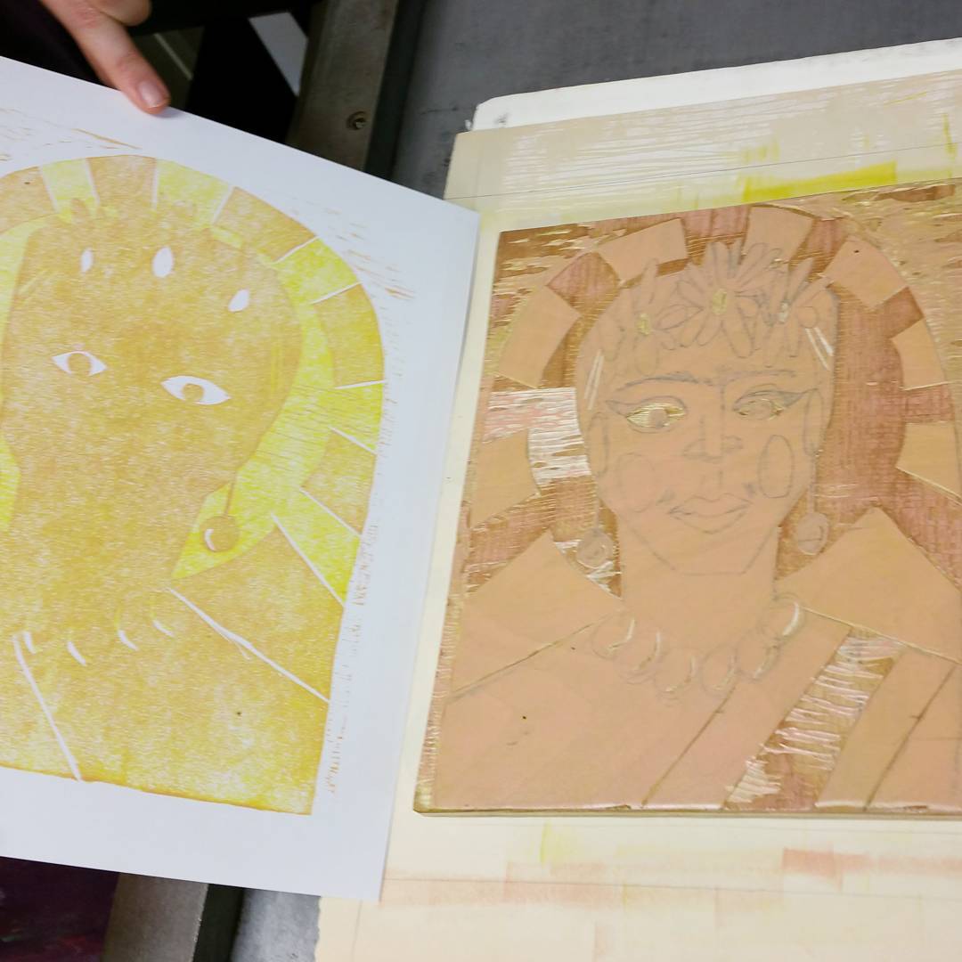
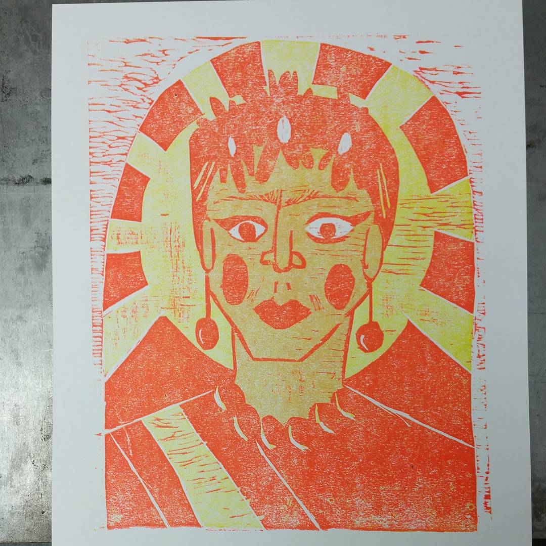
On Monday night we got this student print finished with a whirlwind printing session of three colours, including carving the block in between. The student had careful plans drawn out in her sketchbook and a good sense of the colours she wanted to use, so she was able to work efficiently to get the last three colour reductions finished in just two and a half hours. Here’s the final six colour print:
And below is how we got there. At the beginning of the session the block was all carved and ready for colour #4, a 50-50 mix of process magenta and transparent base:
Then after some more carving, colour #5, a semi-opaque teal:

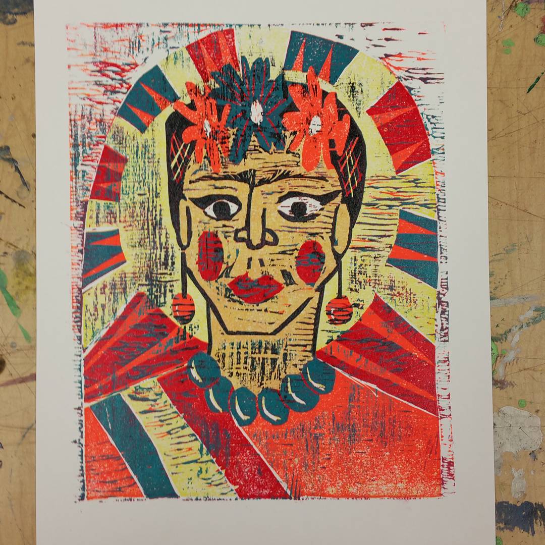
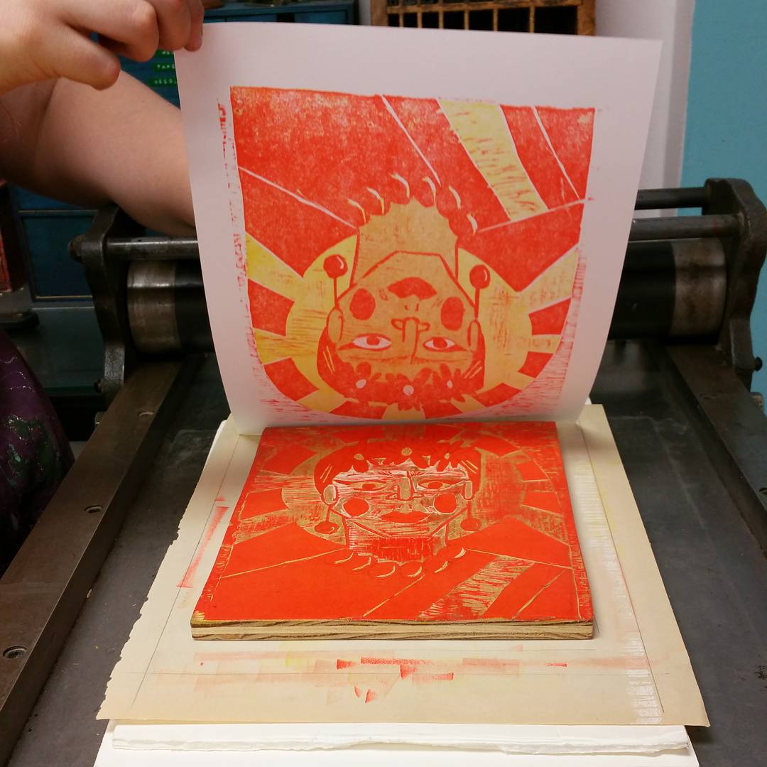
After this layer was printed was when I noticed that the baldric-type strap over Frida’s shoulder was green, white, red, like the Mexican flag. A fluke, as it turned out, but perfect.
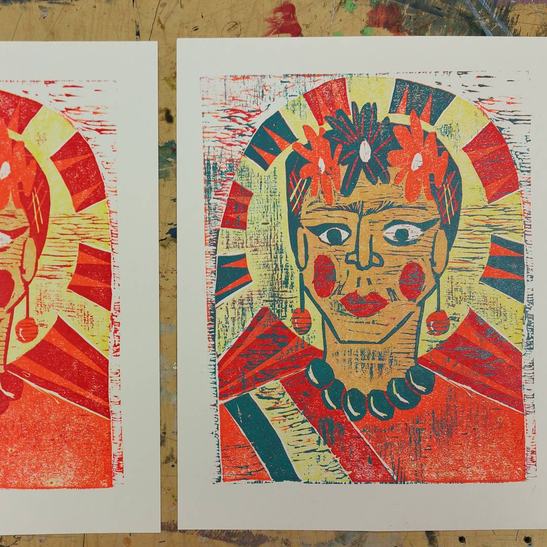
Finally, all but the lines on the face were carved away, and what was left was printed in black. The student did some selective inking here in order to preserve the colourful wood chatter elsewhere in the print.

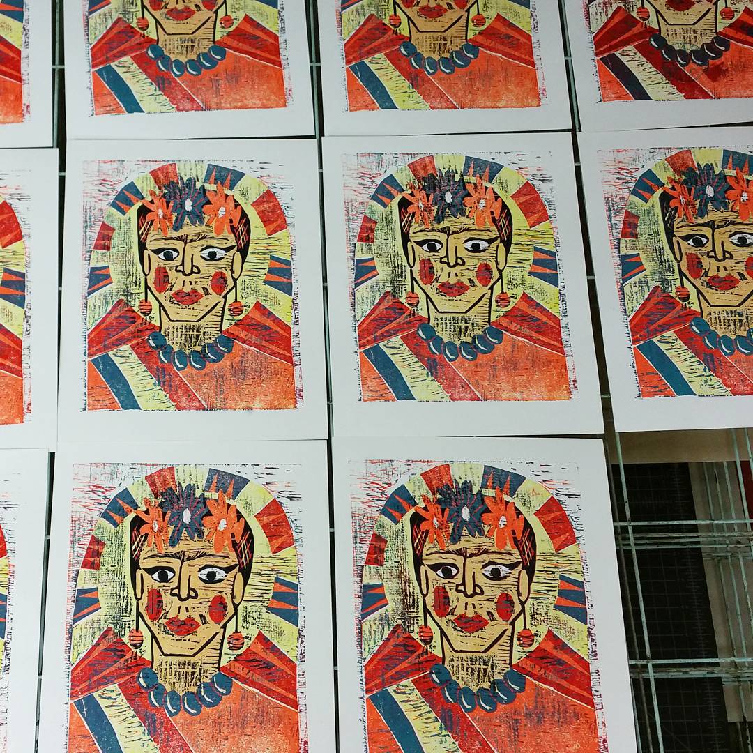
There was great consistency across the edition too. We’re so pleased with the final result!
Two new layers on this student woodcut from last night’s class! First, an orange-peach tone to darken the skin in the face a bit, then a bright orange (it’s our shop favourite Day-Glo orange ink again, with a bit of Gamblin block printing ink in Napthol Scarlet mixed in just to tone down the neon glowiness a little).
Here’s colour number two in the drying rack:
And the block:
Here’s the pull for colour number three:
Three colours finished and drying:
In next week’s session we’re hoping to bang out three more colours in three hours.
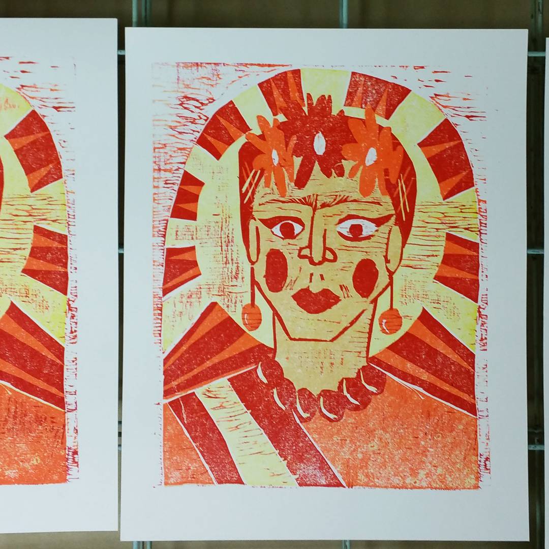
I printed the third colour, white on both versions, on the print I’m planning to use as a teaching tool for reductive woodcut classes. The background is really starting to look like snow now.
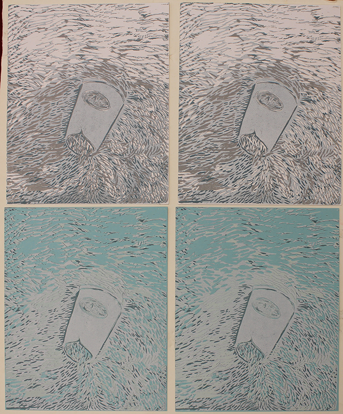
Here’s the progression of colours so far, from left to right: pale gray, then teal, then white on the white paper; white, teal, then white again on the blue paper.
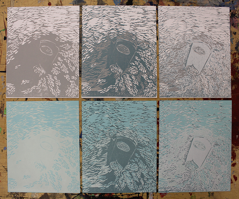
The block has now been all carved out ready to print colour number four, which I hope will finish off the snow so I can switch to the warm brown and red tones in the castoff Tim Hortons cup.
This is our third time running the Reductive Woodcut class. Just one student this time, which means she gets private instruction for the (lower) price of a group class. Summer is a slow time for classes, so we really appreciate anyone willing to give up a couple of precious summer porch evenings in order to come in and learn something amazing with us.
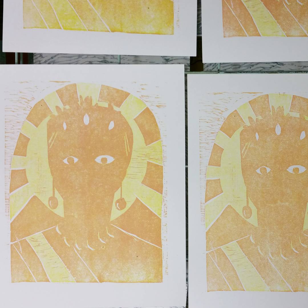
Here’s our student’s inked block getting ready to print: it’s a portrait of Frida Kahlo in a style that reminds me of Byzantine icons. Gorgeous, and it gave the student and I a chance to share our love of Kahlo’s work and our excitement about having recently seen the Kahlo and Rivera in Detroit exhibition at the DIA.

No shots of the print this week, because it’s impossible to see or photograph any detail in an all-yellow print. Stay tuned for next week when we print the second colour (and possibly the third, if we work quickly)!
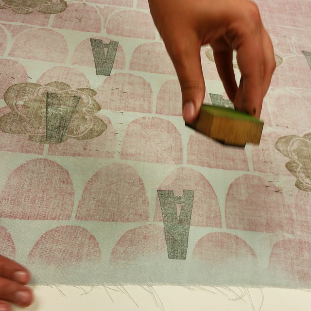

Here are the gorgeous fabrics created by our most recent students. They started with a base layer of printing from large wood blocks chosen from our woodblock library, then created their own designs by hand stamping smaller linoleum blocks and letterpress type and ornaments.
It’s fascinating to see the vast difference between these pieces and the ones made by the previous group who took this class, using the same blocks and fabrics. It gets me so excited about the possibilities for what people can accomplish in this class!
Here are some shots of tonight’s full pieces of finished fabrics:


Today I made some calendar pages for the studio wall, to better keep track of scheduling for classes and private instruction sessions. This is a handmade prototype version of a line of letterpress and screenprinted wall calendars we’ll be making for 2016!
My friend Monica came into the studio yesterday to keep me company on a rainy day while I completed a grant application. I gave her a quick lesson in trace monotype printmaking, set her up with paper and an inked slab, and she made me this wonderful print for the studio:
Those bound pockets on the shirt on the right had me swooning.
I’m going to frame it and use it to start a little collection of gifted artwork on the back wall of the studio overtop of the flat files and stereo. Kind of like that bulletin board full of one dollar bills you see in restaurants and variety stores!
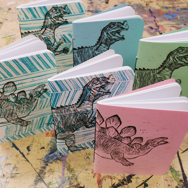
Just put the finishing touches on these rad new dinosaur notebooks, featuring linoblock portraits of a few toy dinos from our collection:
We’ve also got a new line of greeting cards in the shop featuring these fearsome dudes. I’ve cut a second block to add some colour and will be printing multicolour dinos this week. Thinking about printing them on some t-shirts too!